

Creating an online form to apply for a vehicle title.
Solo project. Research, define, ideate, design, prototype, and iterate.
There are only a few tasks the Texas DMV portal site, Texas x Texas, allows Texans to do: vehicle registration renewal, going paperless, replacing an ID or changing address on an ID, and updating emergency contacts. I was not able to find specific numbers from the Texas DMV on several statistics, such as how many people use the DMV per year or per month. In lieu of precise information, I turned to news reports. If they aren't allowed to renew online, Texans in certain areas are waiting months to get driver's licenses.1 This from an article in 2023. With the need for identification to meet the legal requirements set by the REAL ID Act for ID holders to be able to fly, some Texans in 2025 have to wait 133 days to get an appointment.2 With such high demand for in-person interactions, other DMV processes also suffer if there is no online option.
1
2
https://www.chron.com/news/article/texas-real-id-dmv-20268753.phpFor so many bureaucratic tasks, users still have to physically go to the DMV. For some tasks, users can send in a form through the mail. Going to an appointment is a significant time commitment and users must remember to bring all the required materials. Mailing in a form is a slow process; many users cannot wait the weeks it may take to receive a response. More and more people are looking for online options and government sites, especially who serve large portions of the population, should provide them.
Create an online option to apply for a copy of a vehicle title online. The PDF of the required form can be made into an online form that can be submitted electronically, streamlining an already existing process. This would eliminate the issues that users can encounter with the two available options: e.g. not having a printer, not being able to take off work to make it to an appointment. And with exponentially long wait times for DMV appointments, any online process would alleviate stress for Texas drivers.
Choosing my competitors was pretty easy; I simply chose three different states' motor vehicle agencies to see how they had set up their sites. I wasn't only interested in how to get a copy of a vehicle title. I wanted to see how their other processes worked. How many offered online services, forms, and applications? Which services did they provide online? What services did not have online options?
My first competitor was indirect: AAA. AAA has been around long enough to know what its customers need, so I analyzed their site with that in mind. How did their online services work? What did they offer and how?


An Indirect Competitor; provides a number of different services for drivers, from insurance to road-side assistance. Memberships starting at $64.99 a year.
Florida Highway Safety and Motor Vehicles. $75.25 for a transfer or duplicate vehicle title. Cannot apply online.
California Department of Motor Vehicles. Pricing is not listed. Can apply online!
Minnesota Department of Safety. $21.50 for duplicate title with fee breakdown. Cannot apply online.
Participants were chosen for their likelihood of having had to interact with the DMV within the last year. I asked questions about their most recent experiences with the DMV and what they were trying to accomplish. I also wanted to know what they wanted out of a DMV experience. If I knew what they said they wanted, I could try to accommodate that.
“But if it won’t let me click to the next page and it doesn’t tell me what’s wrong or it tells me what’s wrong but I don’t know how to fix it. The frustration is more aggravating than the time it takes to do it.”
“We had to go back twice [for registering the car] because we didn’t have the right paperwork."
“Even when I made an appointment [to accomplish a task at the DMV] still took about an hour and half. ”
“They had 1-2 people working. It just felt like there were 10 people in line and only one person behind the counter.”
“My state's DMV website makes me want to go early in the morning and avoid the website.”
“And if I go down there I’ll be missing something and then I guess I have to go home and dig through my records, but if I’m doing it at my computer at home and I’m missing something I haven’t wasted a trip.”
“I’d rather spend 30 minutes online than in person.”
“I’m retired so it bothers me less, but I still would rather do it online.”
About half of my users are retired and therefore have dealt with the DMV for a lot longer. I wanted to make use of that history and those insights in the persona I used for the rest of this project. Most of my interviewees were very clear: they'd rather it take longer online at home than wait in line at the DMV for any amount of time. Being at home is simply more comfortable and that wasn't limited to my retired users. Everyone also mentioned that they were pretty neutral on having to do the tasks done at or with the DMV. A lot of them said, "It is what it is." This wasn't something anyone was excited about, but everyone has to interact with the DMV. My goals in creating a persona were to account for these considerations and make the interaction I was to create as positive, efficient, and clear as possible.

Since the project goal of adding an online form to request a copy of a vehicle title has already been established and this project needed to be done in a limited amount of time, there was no reason to spend time on ideating other features.
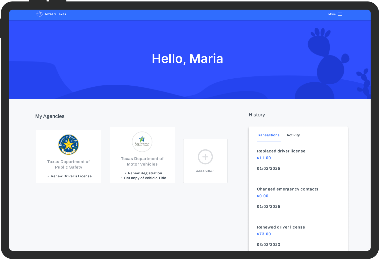
Jumping straight into user flows from our research synthesis, it's important to keep in mind our persona's goals. The user would have to log in to their account. Assuming the user has a vehicle title to request a copy of, they'd already interacted with the DMV site and had an account. Then they had to get to the new option to request a vehicle title, make it through the form, and submit it for review.

It was imperative to start with the existing format, so wireframe sketching was fairly straightforward:
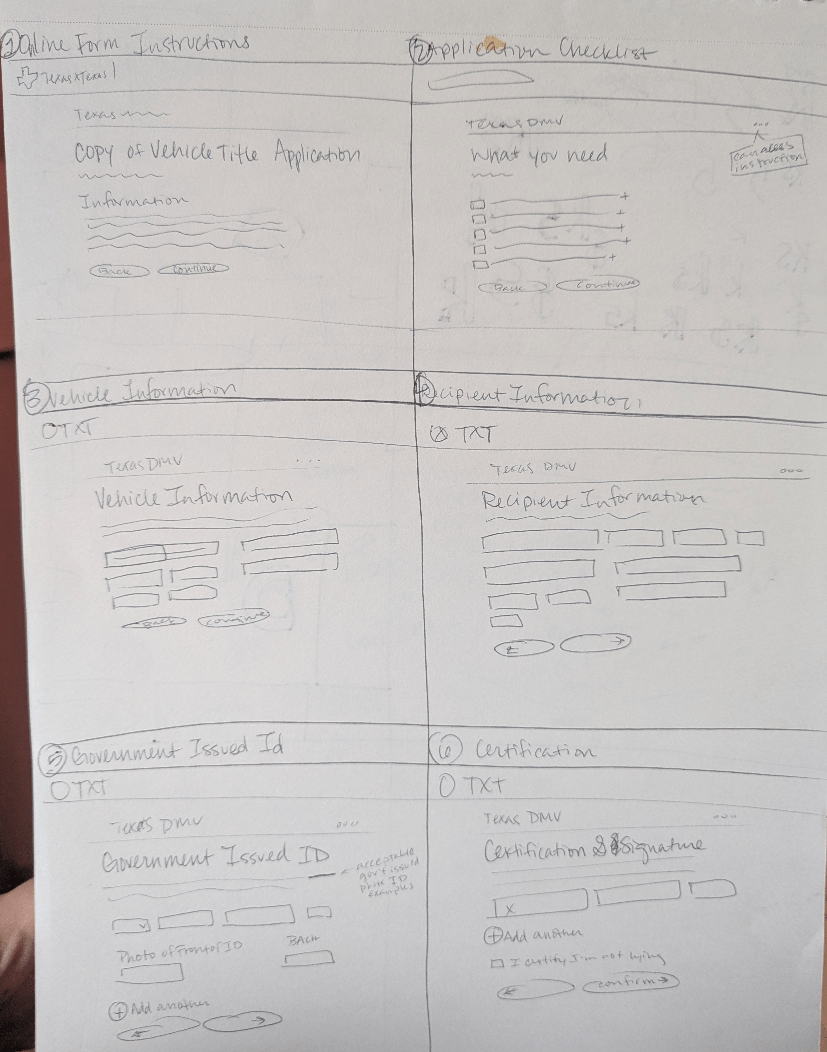

With a design system in place, it was easy to create components that matched the colors, fonts, spacing, etc. I moved straight to mid-fidelity for my first round of user testing. Because there was a form that already existed for this purpose, I was able to use all the copy rather than lorem ipsum. I split the form up into separate pages so that it wasn't overwhelming. I appreciated the checklist on the existing form and adopted that section at the beginning of the form.

Mid-Fidelity Dashboard

Mid-Fidelity What You Need Checklist

Mid-Fidelity Add Photos of ID
I asked my users to sign in and then find, complete, and submit the application for a vehicle title. My main goals of mid-fidelity testing were to identify issues early on, verify that the flow made sense and was easily usable, and to find any missing or confusing elements. I had an advantage since the form already existed, so I knew that the instructions had likely been refined over time so the wording probably wouldn't be an issue.
Main takeaways:

Pre-Iteration Attachments without Delete Icons


Updated Attachments with Delete Icons

Pre-Iteration Confirmation Screen without "Print this Page" Button

Updated Confirmation Screen with "Print this Page" Button
Most of the updates made were easy to decide on because users expressly asked for them, specifically actions they'd like the option to take. These were actions that I should have considered from the beginning and from this project forward, they'll always be on the checklist of elements to include before testing even begins.
Updates:
High-Fidelity Screens:


Key Objectives:
Just like in mid-fidelity, there were things I missed that should have been part of the flow from the very beginning. I learned a lot on this project in terms of features that should always be included. Error messages are standard for a reason.
Stats:
User Observations/Suggestions:
The main goal of these iterations was to provide guidance. It's easy to put either too much information on the screen or not enough and testing allows the pain points of too much or too littler information to come to light. Not all information needs to be displayed at all times. Many users will automatically upload a lien or their ID photos, but not all. The error messages can present themselves as needed so as to not become clutter.
Updates:

Pre-Iteration Dashboard Agencies without Task Options
Updated Dashboard Agencies with Task Options

Updated Upload Lien Screen with Error Message

Updated Government Photo ID Screen with Error Message
After making these updates, I tested again with 3 different users. The error messages worked well as users still failed to upload items, but with the error messages every user completed the flows with all necessary information input.

I ran one final test to see if my final iterations helped avoid some of the problems users had with the flow. All of my iterations smoothed out the process significantly and users found it straightforward and easy to use.
Working with an already existing website was very important to my progress. It’s more likely that I’ll be joining a team that already has a UI system, so it was good practice to use a system that I didn’t create myself.
I enjoyed that the target audience for government websites is literally everyone. I didn’t have to find a specific demographic besides “drivers.” Due to the nature of government being a part of everyone’s lives, it was interesting and eye-opening to get feedback from strangers. Though, making sure I was accounting for the needs of such a diverse group of users was definitely one of the challenges. Before every user test I was sure I had accounted for everything, but users continued to surprise. It was a challenge I was excited to rise to.


Disclaimer: "Business Therapy" is a consulting service focused on operational systems and company culture. I am not a licensed therapist, counselor, or mental health professional. The services provided do not constitute medical advice, psychotherapy, or any form of clinical mental health treatment.
