
A responsive "how to" website for young adults to learn how to bartend.
Solo project. Research, define, ideate, design, prototype, and iterate.
Starting bartenders don’t have the skills necessary to do their job well. This makes it difficult to get a job if restaurant owners don’t want to devote resources towards training new bartenders.
There are about 700,000 bartenders in the United States, making a median $17.82 per hour, $37,090 per year.¹ Bartending school can cost up to $1500, though usually it’s between $200-$600.² That's a pretty steep price for a relatively low-paying job.
Top research goals:
In order to gather information on the key points above, I used three different methods.

A survey to narrow in on demographics, pain points, and information organization. Thirteen people took this survey which provided a good starting point.

Competitive analysis to see what direct and indirect competitors offer.

User interviews to hear from users first hand their stories of how they learned to bartend, what they could have benefitted from while learning, and which topics were the most frustrating.
The most helpful information gleaned from the survey was that of the 13 people surveyed all of them started bartending in their twenties and that proportions and memorizing builds were the most difficult skills to master.
With these bits of information in mind, I was already narrowing in on the main flow to create and the brand design. More on these later.


Competitive Analysis Spreadsheet
I compared four different competitors for my analysis.


A subscription-based model for which users can pay $120 for the whole year, but the bartending course is only about 4 hours. Users have access to all the other courses.
A physical school with locations in Austin, Dallas, and Houston. They have in-person classes only with set afternoon and evening options.
Indirect competitor. A social media platform accessible to all, free with ads. Anyone can upload videos.
A book written by a master mixologist containing historical information, recipes, and breakdowns of tools and skills.
I spent at least 30 minutes walking through the same list of questions with each participant. Instead of racing to the next question, I asked follow-up questions to most answers and encouraged stories. Participants were excited to share their experiences and opinions which led to some very clear pain points for me to solve and welcome insights to use going forward.
Now that I had my user pain points, I used POVs (point-of-view statements) to define user needs. I then translated these into HMWs (How Might We statements) to begin the ideation process. I narrowed them down from four each to two each.
McCade just got a new bartending job and needs a way to memorize ingredients so that he can make cocktails quickly to keep up with demand.
How might we make it easier and faster to memorize cocktail recipes for new bartenders so they can make a lot of drinks during a rush?
Taylor, a new professional bartender, needs to learn about the proportions of standard cocktails so that she can more easily memorize builds to keep up with the fast-paced work environment.
How might we teach new bartenders the proportions for standard cocktails so they can memorize builds more easily?

Based on all my research, most new bartenders are in their 20s and a good portion of them only bartended for 1-2 years. From this I inferred that bartending is a transitional job for most people at the beginning of their adulthood. I built a persona with these thoughts in mind. Here we have Michael Walker, a 22-year-old, part-time bartender, and part-time community college student.
In interviews, I learned that memorizing and proportions were the main pain points, so those are his main needs. I also learned that most people who learned how to bartend did so because it made them feel "sophisticated," "cool," and "adult." Michael feels the same way
Since memorization is the main user need when learning how to bartend, I did some research on memorization techniques. The one that worked best with my project was a memorization game. I also needed to consider business and user needs alongside technical considerations when coming up with not only memorization games but the necessary features of a working website.
After having fun ideating possible features without considering feasibility, I concluded flashcards were not only one of the most effective games for memorization, but also the most doable within the time frame of my project.
Given more time and a budget, I would build out the rest of these features, but within the constraints of the project, I stuck with the Must haves. The two features I decided to build out are the onboarding process (Account Creation) and flashcards (Memorization game 1).

There was a lot to consider in organizing the site - how the product would look as a whole and what it would contain. I had a lot of fun fleshing out the Information Architecture of the site and all the content it would have. Most of the features above found homes within the sections of the site.
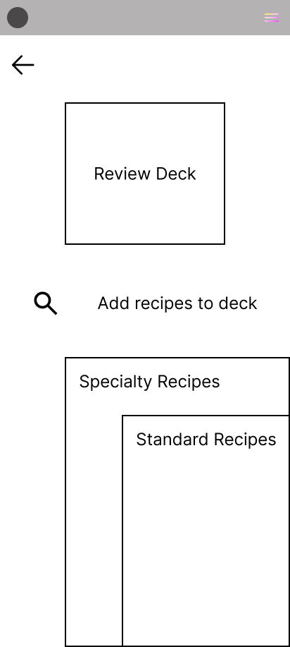
Within the scope of this project, however, I needed to create two task flows. I settled on a Sign-up flow with a quiz to direct users to subscribe to a paid plan and, the most important, a flow to review a cocktail recipe flashcard after adding it to their deck of recipe flashcards. Creating these was an exercise in simplification and then further simplification that I found more difficult than other areas the UX process. My brain had already jumped to the next step and was already starting to flesh out ideas. These are important steps, however, as they clarify and specify what exactly is needed in the next step of the process.


For inspiration before I started sketching, I perused a number of different sites to gather ideas on design patterns. I started with sketches to run through iterations until I decided on screens that were laid out well and easy to interpret.


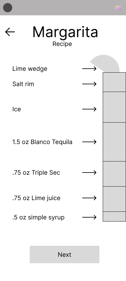
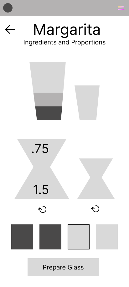
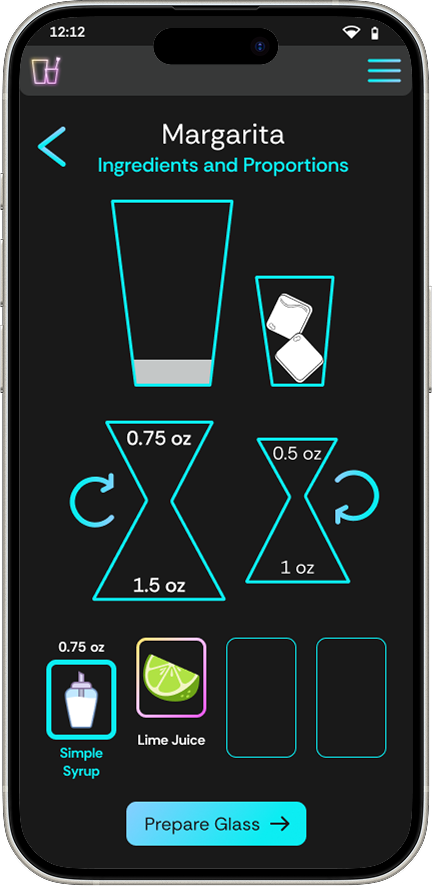
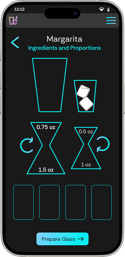
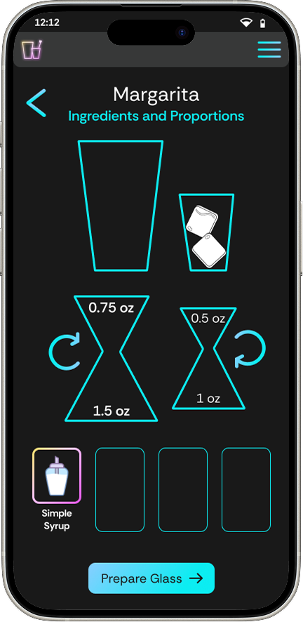
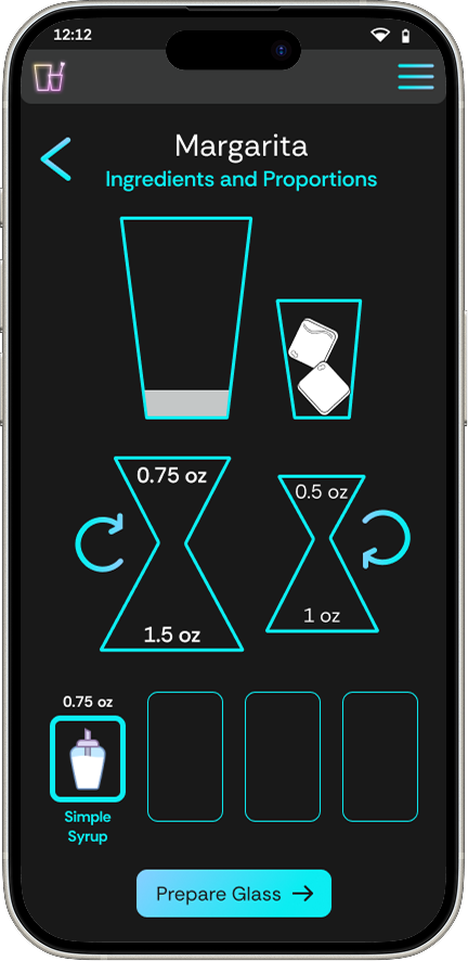
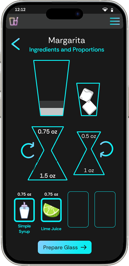
Then I created them digitally. Not all my sketched ideas made it into the digital version, but I kept them in mind in case my mid-fidelity testing in case one of the designs proved confusing. For what was standard - like the onboarding process - I chose designs that were similar across most platforms. I wanted the process to flow smoothly and using systems already in existence is a good way to make things easier on the user. For screens and flows that are specific to my project, I chose designs that I felt were the most straightforward. My goal was that the Ingredients and Proportions screens won't need too much explanation as I'm trying to keep the small space uncluttered.
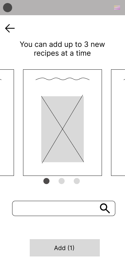
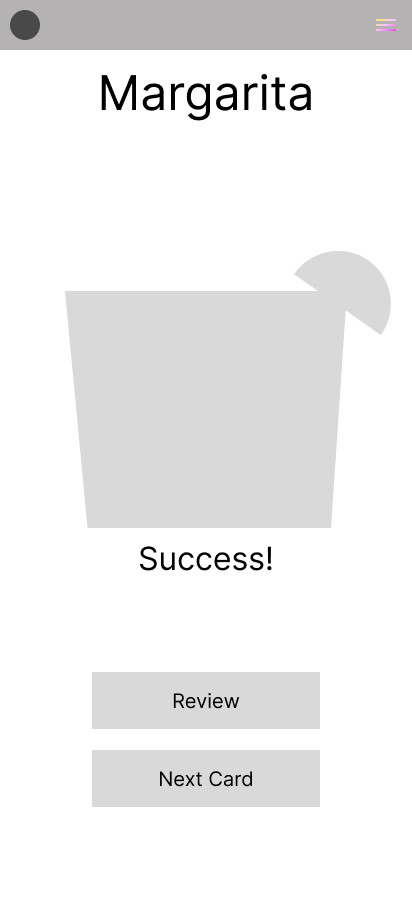
To make sure my ideas were sound before continuing, I conducted a simple usability test with my digital wireframes. I used the prototyping feature in Figma and asked my users to firstly, create an account and choose a plan, by either taking or not taking the quiz. The next task was to add a card to the flashcard deck and then review the recipe. I found a couple issues right off the bat, for which I was thankful! Better to find problems early.

Our persona, Michael Walker, is representative of young 20-somethings. If you’re a young 20-something interested in bartending, you’re probably interested in being at bars and nightlife and from there we can intuit that you're probably going to be more of a night owl. And because my potential users are younger and likely to practice memorizing cocktail recipes on their phone, I went with a mobile-first design.
A dark theme will accommodate this well, with neon bar signs being the main source of inspiration: bright, glowing colors on a dark background. Easy on the eyes at night.

I went with Rethink Sans because, for a mobile-first design, we needed the small text on a phone screen to be easy to read in a range of sizes. The small screen is less cluttered without a serifed font.


After creating a component library, I set to work putting everything together to make my high-fidelity screens. If you'd like to view the component library, please follow the link below.
Component Library


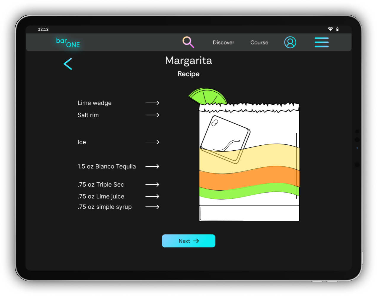
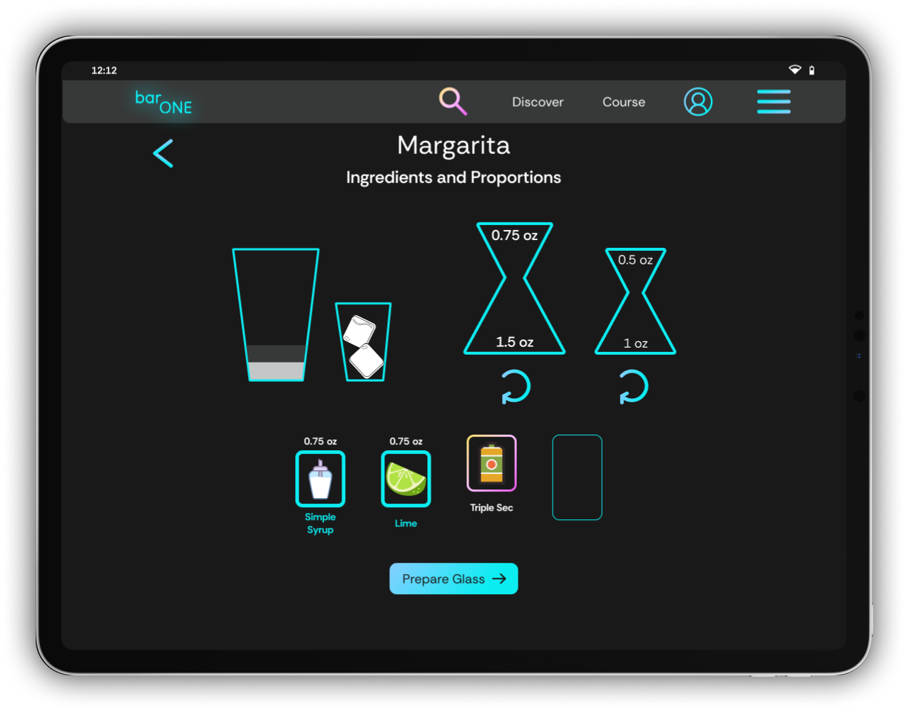
Based on my research, if my users weren't going to use a phone to access the responsive website, they'd likely use a tablet. So, I mocked up some high-fidelity screens for an iPad to show how the designs would work on my responsive website. I didn't have to change the designs too much in the transition from mobile to tablet, but because the layout changed from portrait to landscape a few things did need to be moved around. The shaker and the jiggers are now on the same horizontal line rather than on top of one another. The font also went up a couple sizes to be easier on the eyes.

Instead of testing the flow as in mid-fidelity testing, this test was more for the components on each screen. Did all of the options make sense? I asked the users to do the same two tasks: sign up and choose a plan, then add a card to their flashcard deck and review it.
Usability Test PlanI was hoping that my configuration on the Ingredients and Proportions pages would be relatively intuitive, but even experienced bartenders struggled to understand exactly what they should do at any given moment. And if you're learning, you'd need some guidance anyway. Luckily, this was an easy fix found on many sites and apps, especially after updates: add instructions.
Note: when you open the link, you will only see one flow (Sign Up and Choose a Plan). If you go to the top left and click the middle icon, you'll have the option to select the second flow ("Add Card and Review).
So we went from a flow without instructions:
To a flow that starts with instructions:


I learned quite a lot over the course of this project. Task and user flows along with prototyping ended up being the hardest for me to wrap my head around, but I believe I have a good basis now to continue to improve these skills moving forward. I found that user interviews and building the high-fidelity screens were my favorite parts of the UX design process; I enjoyed learning about other people's experiences and the opportunity to be creative. In the future, if the opportunity and/or time arises, I'd be excited to build out this whole website with all the features ideated.
Thank you for taking the time to read about my project!
¹ https://www.bls.gov/oes/current/oes353011.htm² https://www.bartenderplanet.com/how-much-does-bartending-school-cost/


Disclaimer: "Business Therapy" is a consulting service focused on operational systems and company culture. I am not a licensed therapist, counselor, or mental health professional. The services provided do not constitute medical advice, psychotherapy, or any form of clinical mental health treatment.
