
The Austin Zoo is a rescue zoo supported by donations to take in animals from many backgrounds. The offer family-friendly events, animal rescue initiatives, and educational programs. They boast over 300 animals of more than 100 species.
Redesign the website with a responsive foundation, streamline usability, and introduce targeted features that directly address user pain points.

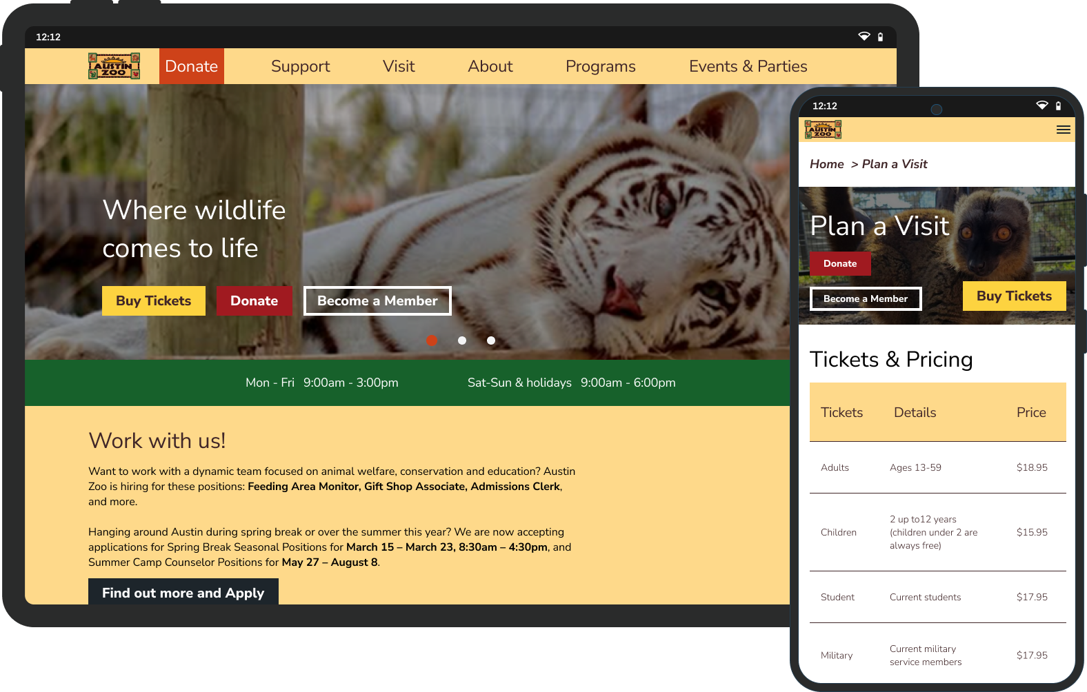
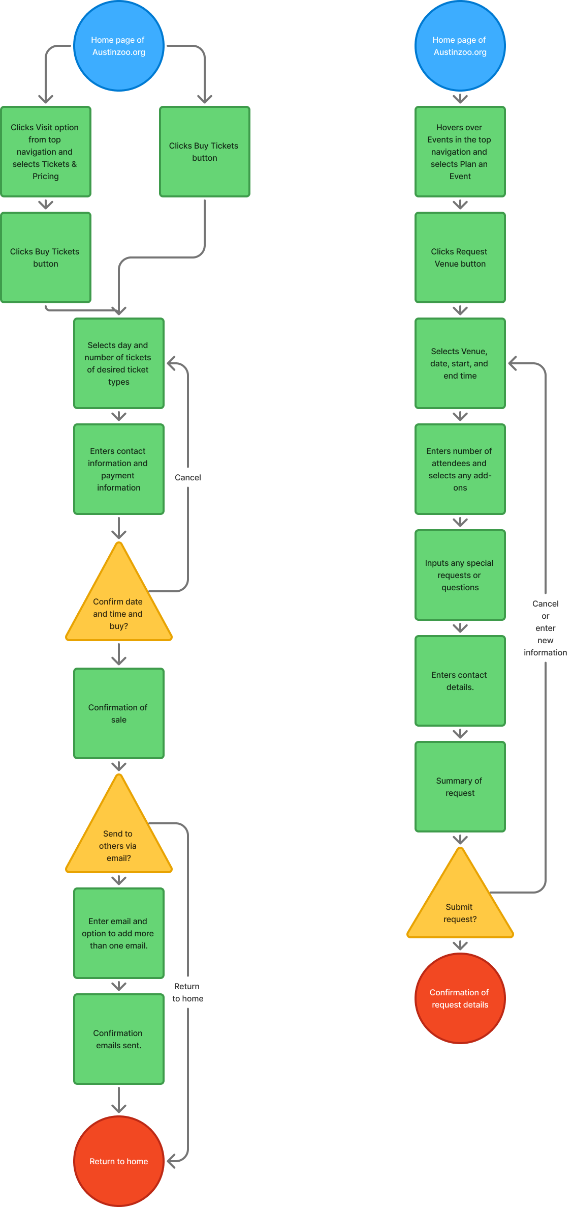
Users face significant frustrations when navigating the current site. First and foremost, the inability to purchase tickets online prevents users from completing a primary goal, leading to immediate drop-offs. Planning events, such as zoo parties, is also burdensome—users must call or email for basic information, creating unnecessary friction. The site’s confusing structure and outdated visual design further undermine trust and ease of use. Weak typographic hierarchy makes essential content hard to scan, and low contrast text raises accessibility concerns.
To address these pain points, I incorporated the following features:
Designed a streamlined user flow for ticket purchasing.
Defined a step-by-step purchase path that eliminates dead-ends and reduces friction, enabling users to securely complete transactions in just a few taps.
Developed a dedicated user flow for party/venue requests.
Created a guided inquiry process with clear form fields (event date, group size, contact info), reducing reliance on email/call outreach and empowering users to self-serve.
Restructured the information architecture for intuitive navigation.
Reorganized content into logically grouped sections, re-labeled menu items, and simplified hierarchy—aligning navigation with user expectations and decreasing time-to-task completion.
Enhanced brand color palette for accessibility-forward design.
Adjusted color shades to improve contrast while retaining brand essence, boosting readability for all users (especially those with low vision) without disrupting visual identity.
Refined typography system to reduce cognitive load.
Introduced a clearer typographic hierarchy—consistent font sizes, weights, and spacing—to improve scannability and help users differentiate key information quickly.
Both user and zoo staff needs had to be accounted for on this project and in most cases they overlapped. The solutions I put in place are designed and tested (and retested again) to alleviate overworked staff and streamline the experience for users in an intuitive, engaging way. A good design solves a problem. A great design solves multiple.
Disclaimer: "Business Therapy" is a consulting service focused on operational systems and company culture. I am not a licensed therapist, counselor, or mental health professional. The services provided do not constitute medical advice, psychotherapy, or any form of clinical mental health treatment.


