An iPhone frame with a yellow and pale green homepage and a macbook frame with the Services page all on a yellow to green gradient background.
Responsive redesign of a general contractor's website.

EB Bookkeeping

  • 👩My role: UX Researcher and Designer
  • ‍💼Project: B2C, general contractor, responsive website redesign
  • 🗓️Timeline: 2 months

Overview

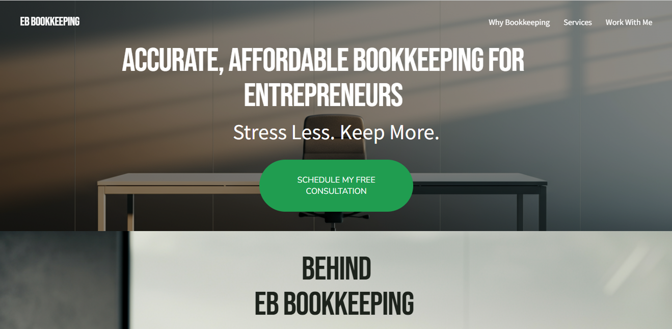
EB-Bookkeeping provides specialized financial services for modern entrepreneurs, with a primary focus on barbers. While the original website was technically functional, it lacked the visual cohesion and professional "edge" required to resonate with a style-conscious clientele. To better serve this creative niche, the brand needed a digital presence that felt as sharp and precise as the businesses it supports.

Objective

The goal was to execute a comprehensive visual overhaul rooted in structural integrity. I aimed to transform the user experience from "functional" to "authoritative." The ultimate mission was to build immediate brand trust; in the world of finance, a polished, consistent aesthetic is the primary indicator of professional reliability.

Research Strategy

  • Industry Research: Reviewed five competitor bookkeepers’ sites for features, language used, and structure.
  • Limitations of the project prevented interviews with barbers for more a rounded dataset off of which to base decisions.

Pain Points and Solutions

room to Improve

Inconsistent visual structure including:

  • Typographical hierarchy
  • Photography/image use
  • Spacing
  • Branding

Screenshots of Original Site

The original hero section of the site. White text "Accurate Affordable Bookkeeping for Entrepreneurs" above "Stress Less. Keep More." followed by a big green call-to-action button. The background is a grey room with an empty modernist desk.  Screenshot of the services page. The background is gray, the spacing is inconsistent and the photos for each service aren't quite accurate: a desk with two laptops and a hand writing on some paper for "Income and Expense Tracking." A bank safe for "Account Reconciliation." And an iPad with a printed out set of graphs and a hand with a pencil for "Financial Statements." Spacing is inconsistent.

Make-over

Created consistent visual structure.

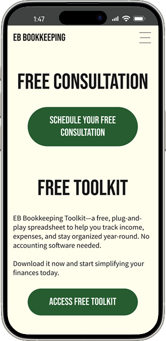
Scalable Typographical Hierarchy
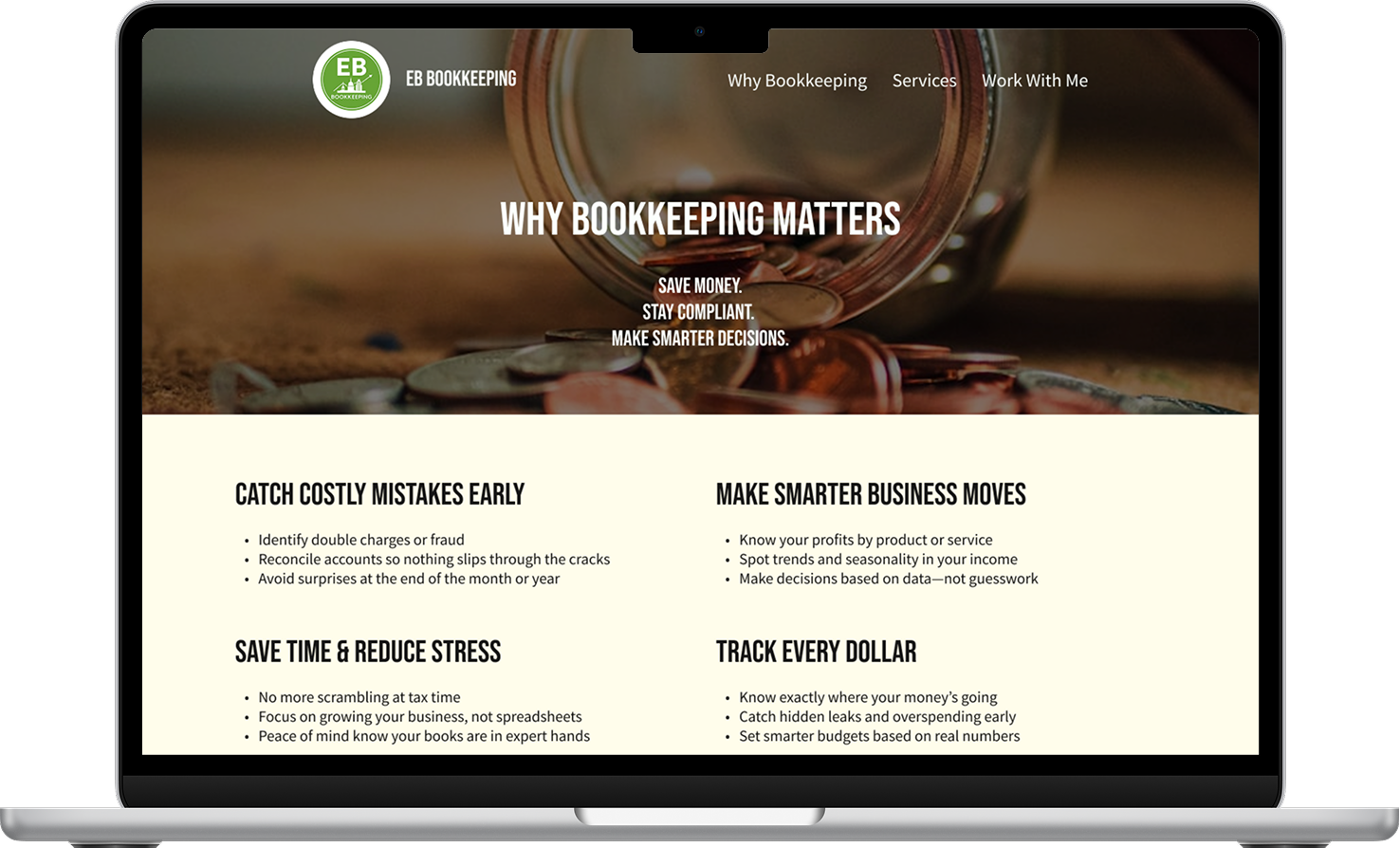
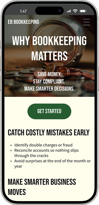
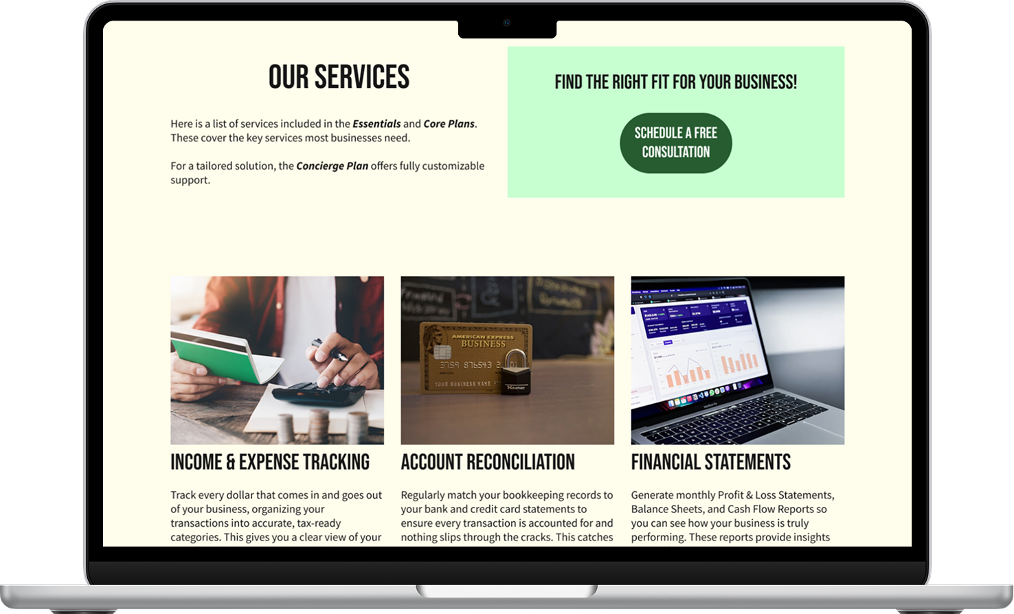
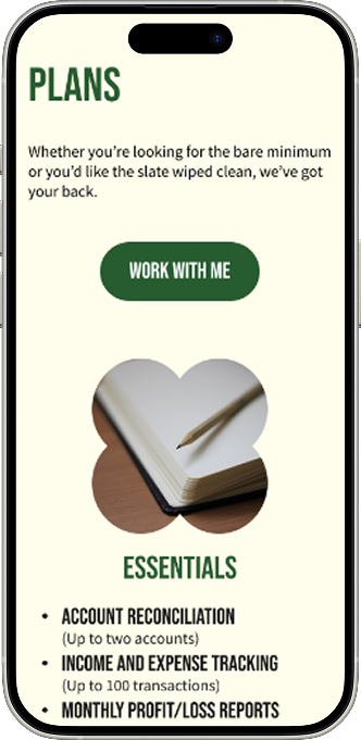
Using the client's chosen typography as a springboard, I developed a cohesive and scalable visual hierarchy. This framework was intentionally designed to grow alongside the business, effortlessly accommodating future service expansions and new educational content.
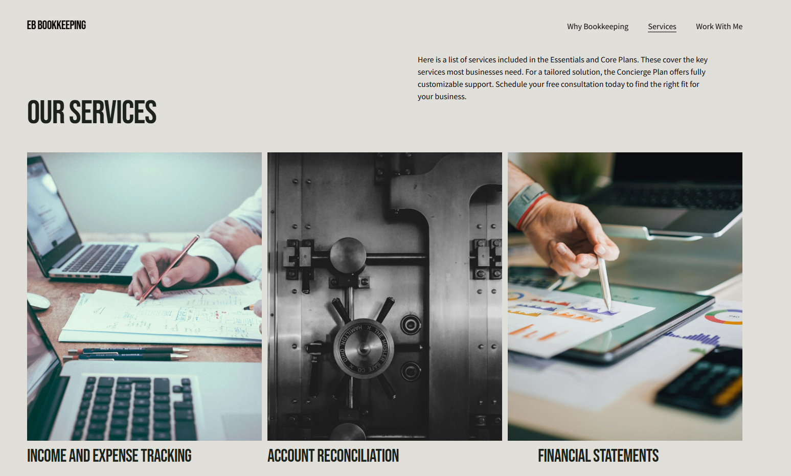
Photograhy/Images
I restructured the visual storytelling by placing photography with intent. By following established UX patterns and eye-tracking conventions, I ensured the imagery guides the visitor's focus toward key information and calls to action.

Spacing
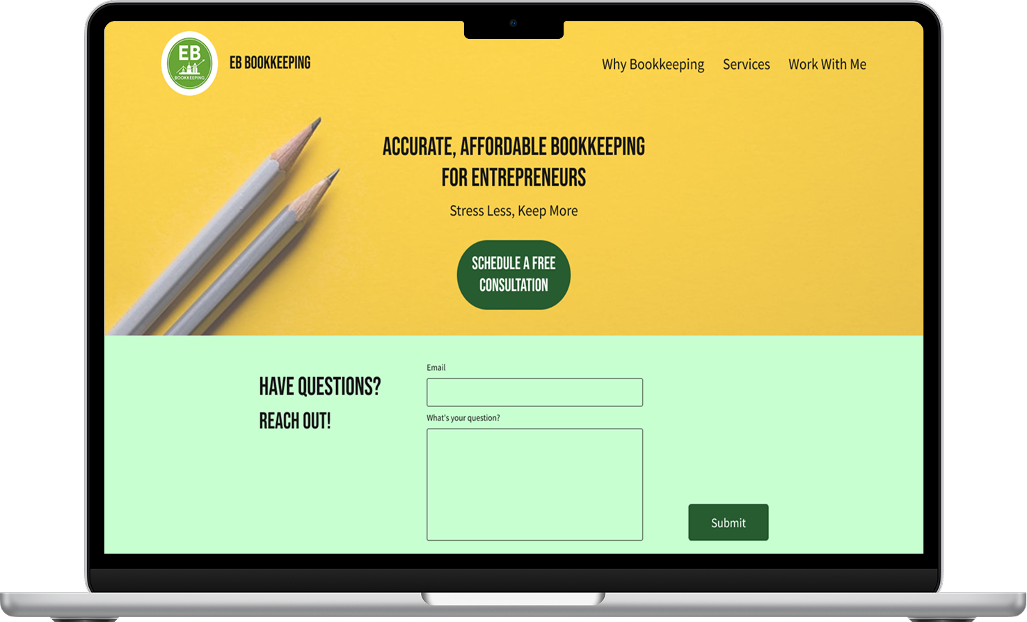
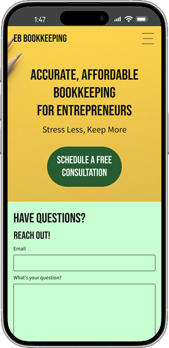
I overhauled the site’s layout by implementing a rigorous spacing system. By replacing the original, inconsistent padding with a standardized grid, I achieved a sense of visual rhythm and professional polish that was previously missing.

Color Palette
To resonate with a younger clientele, I developed a palette that prioritizes energy over formality. By intentionally avoiding the muted neutrals of industry competitors, I selected a 'fun-forward' set of colors that breaks the mold of traditional bookkeeping. The result is a visual identity that feels as innovative and dynamic as the clients it serves.

Final Product

New homepage with a yellow background and two pencils above a light green contact form - in a macbook frame.New homepage with a yellow background and two pencils above a light green contact form - in an iPhone frame.New "Why Bookkeeping Matters" page with a hero image of a spilled jar of coins - in a macbook frame.New "Why Bookkeeping Matters" page with a hero image of a spilled jar of coins - in an iPhone frame.New Service page with three services listed: "Income & Expenses," "Account Reconciliation," and "Financial Statements." The photos, respectively: someone holding a checkbook and typing into a calculator, a gold credit card with a padlock in front of it, and a laptop with an analytics dashboard open - in a macbook frame.New Services page, but further down we see "Plans" as the title of this section followed by a "work with me" call-to-action button and the details for the Essential plan - in an iPhone frame.New Work with Me page with two sections: one with a button to schedule a free consultation and one for a free toolkit with a button "access free toolkit" - in a macbook frame.New Work with Me page with two sections: one with a button to schedule a free consultation and one for a free toolkit with a button "access free toolkit" - in an iPhone frame.

Impact

Signifcantly improved engagement on the site.